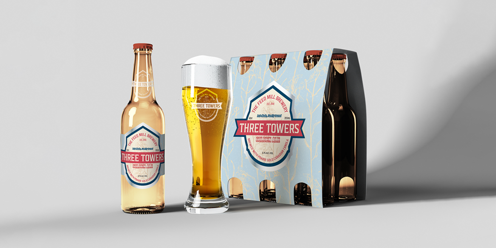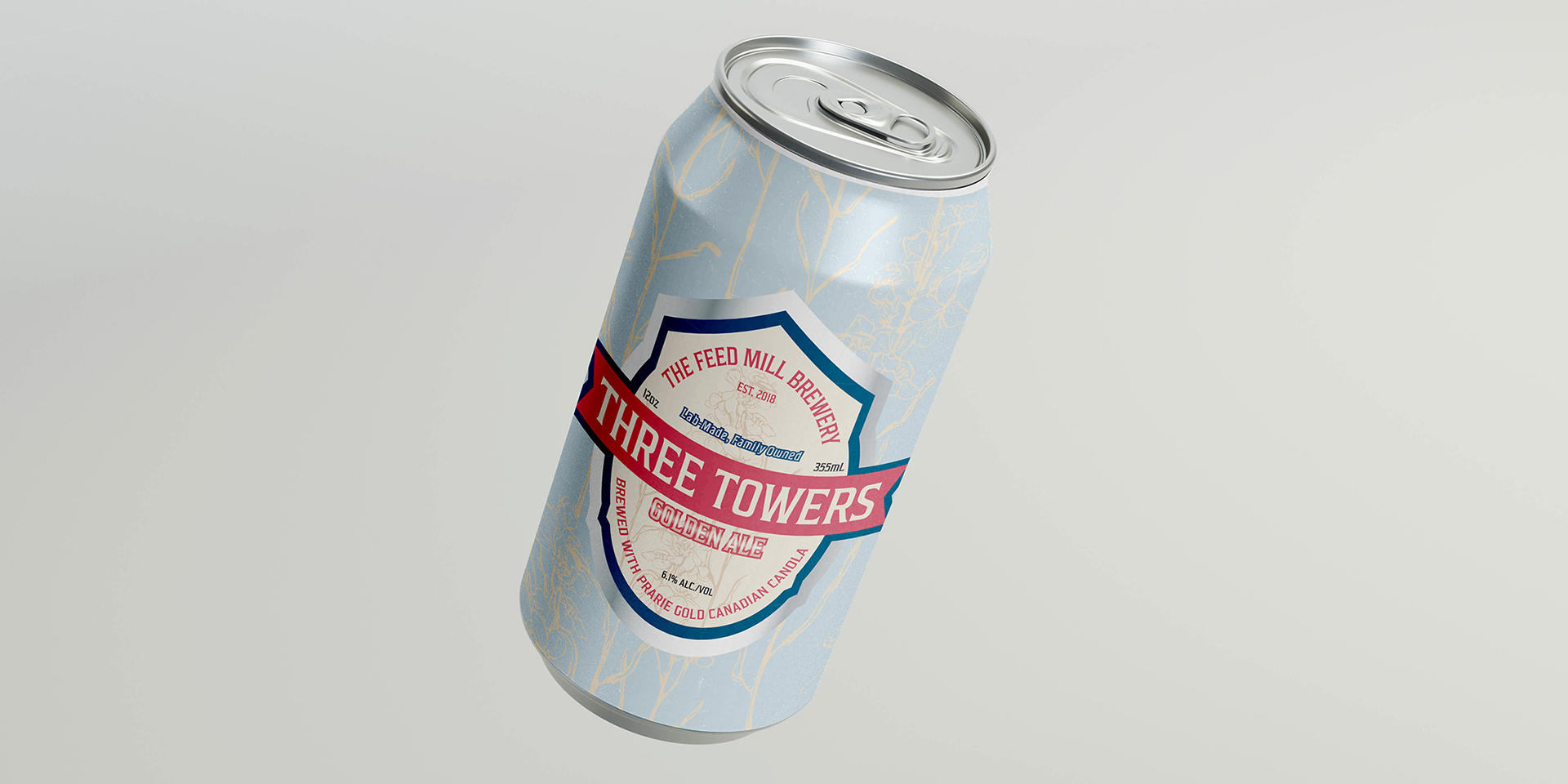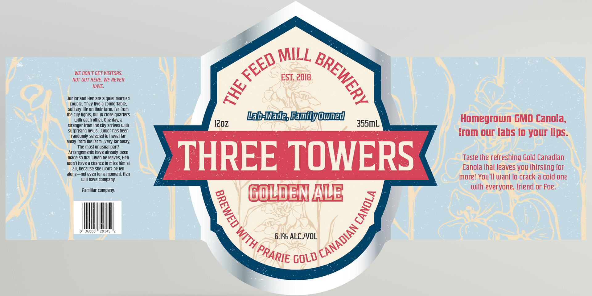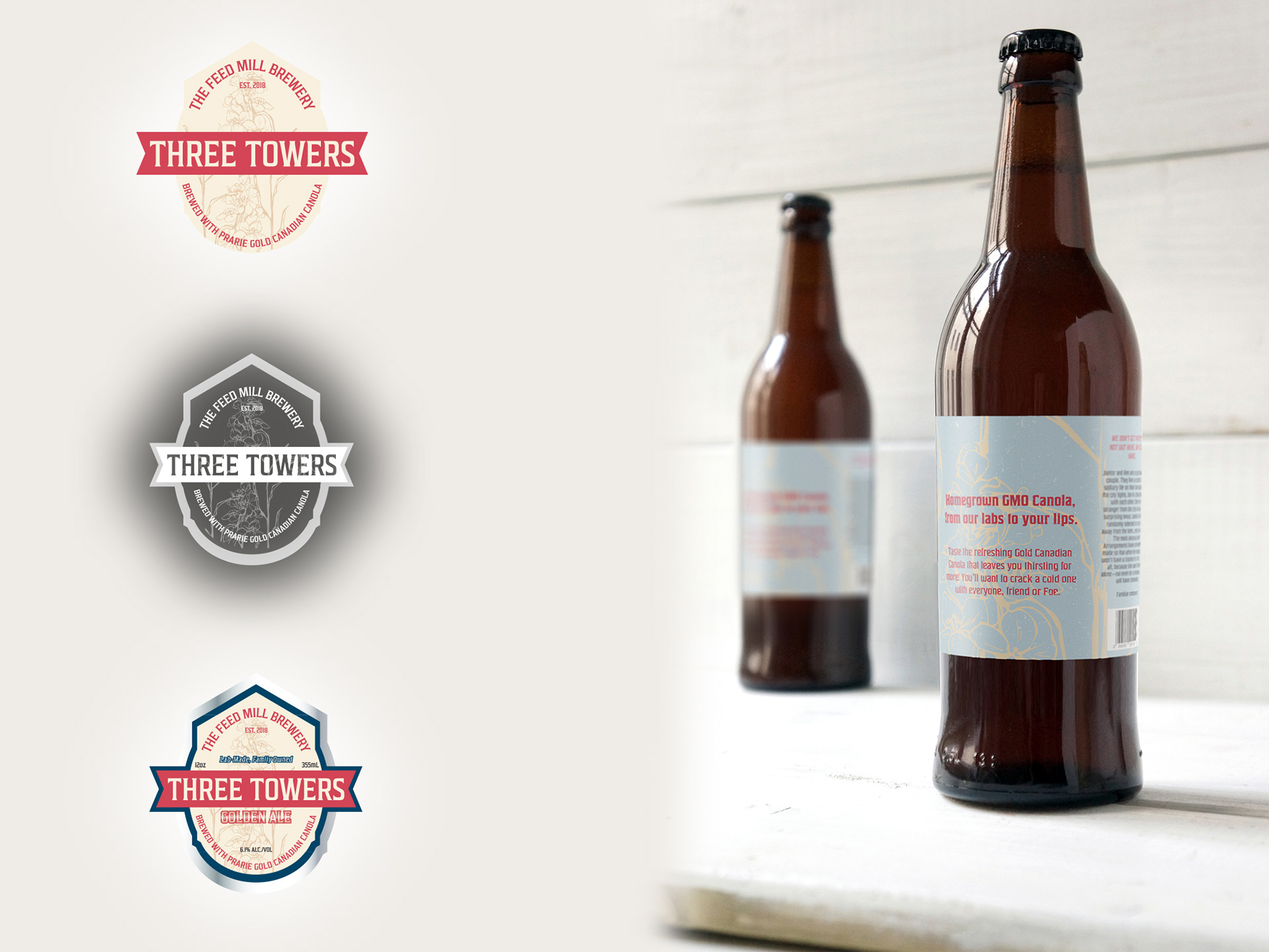
Three Towers Golden Ale is a student-developed packaging project inspired by Ian Reid’s novel Foe. The label and packaging design intertwine the beer motif with societal themes from the book, referencing the brewery’s name, establishment date, and the choice of canola as the brewing grain. The design blends futuristic and rustic styles, incorporating a book summary and a “statement” from the brewery that nods to the protagonist’s constant thirst. The packaging aligns closely with the novel’s narrative and concept, creating a product that could exist both as a beer and a literary extension. The label aligns perfectly with the book and could easily be imagined as a product promoting or between the pages.